Jan, 2020 · 7 min read
Vash Shabanipour
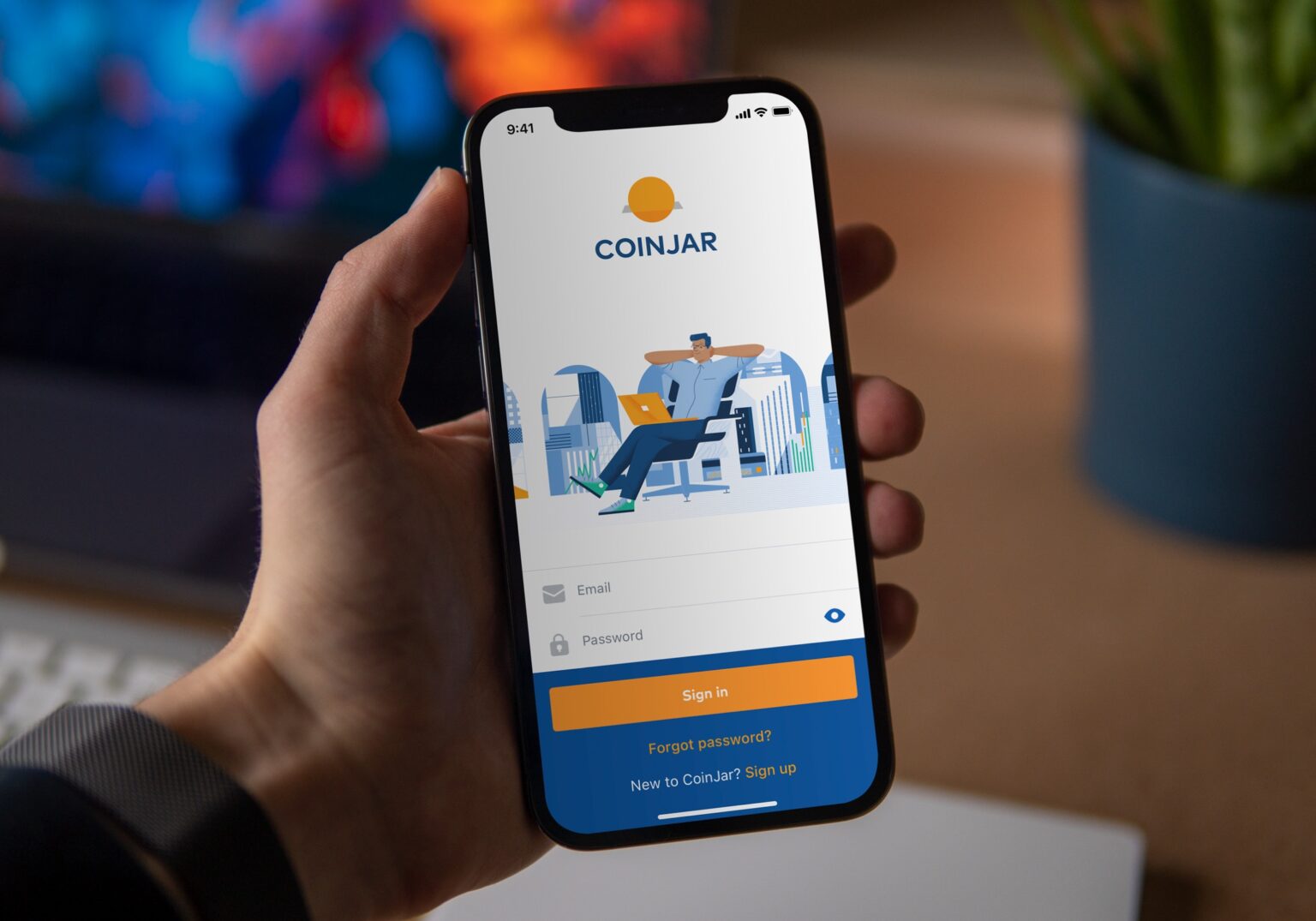
The CoinJar redesign had one goal — bringing cryptocurrency to everyone. As an early pioneer in Australia's crypto scene, CoinJar had always maintained a strong base among enthusiasts.
With cryptocurrency's rising popularity, there was a clear need to make the experience more approachable for newcomers.
In 2015, CoinJar tackled the initial complexities of cryptocurrency by launching it’s first digital wallet mobile apps. By 2020, the user base had evolved, needing a significant backend overhaul dubbed 'Project Riemann’. A step towards making crypto accessible to a wider audience, prompting a frontend redesign that matched the backend's new capabilities and welcomed users with varied experiences.
Equipped with this goal and years of user insights, with a fellow designer, we led the charge in reimagining CoinJar's various platforms. Our task was ambitious yet crucial—redesign all of the existing apps to make cryptocurrency approachable within an eight-month span, bridging a new frontend design with the new backend.
The top highlights of the redesign included:
New Design System: An end-to-end design system covering all the various CoinJar apps.
Streamlined Sign-up and Onboarding: For the newly available automated verification process.
Simplified Transactions: Buying, selling, and transferring crypto with the ease of traditional banking.
Improved Navigation: Using familiar navigation patterns and quick actions for common tasks.
The good, the bad, and the ugly.
We engaged deeply with years of user feedback, from customer support interactions to email and app feedback, identifying the good and bad, that shaped our design approach. With input from stakeholders we came up with the following design principles:
Accessibility for All: Make cryptocurrency accessible to both first-timers and enthusiasts.
Familiar Transactions: Make transactions feel familiar to users of traditional banking.
Universal Design: Create with all platforms in mind for a cohesive user experience, optimising both design and technical efficiency.
Avoid Crypto-Jargon: Use clear language that everyone can understand.
Protect Users: Design with safeguards against cryptocurrency's pitfalls.
Sketch × React.
We knew the only way we could create a cohesive, and efficient design across all of the CoinJar apps was to create a new design system that would cover as much as possible before getting into development. We used Sketch for conceptual and production design, creating a shared UI Kit of over 100 components, each well defined with their use cases, user interactions, and states.
React was the obvious frontend library of choice for its dynamic component system, being native and web ready, and providing a single source across all platforms.
Transitioning from Sketch to React allowed us to efficiently adapt our designs for iOS, Android, and the unique demands of the web app.
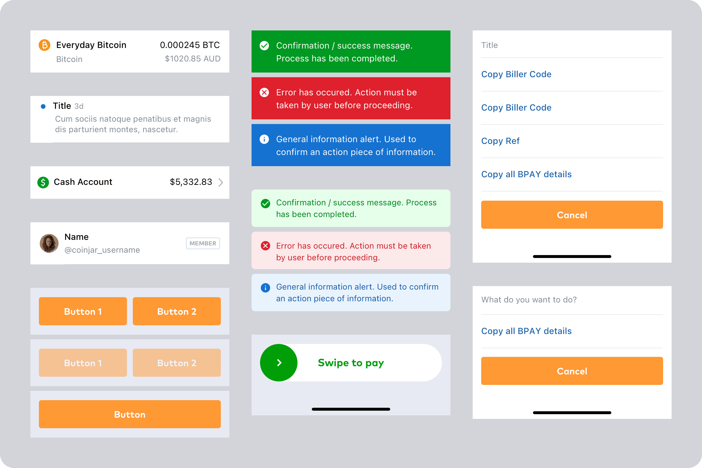
Preview of the UI Kit components with multiple variants for different states and configurations.
One design to rule them all.
Our design approach for mobile and desktop was straightforward: a single-column layout for mobile and a three-column layout for desktop, with dynamic sizing managed by our React components. This strategy, inspired by Apple’s design framework for their iPhone and iPad apps, enabled us to reuse components, views, and flows, adjusting the navigation hierarchy as needed.
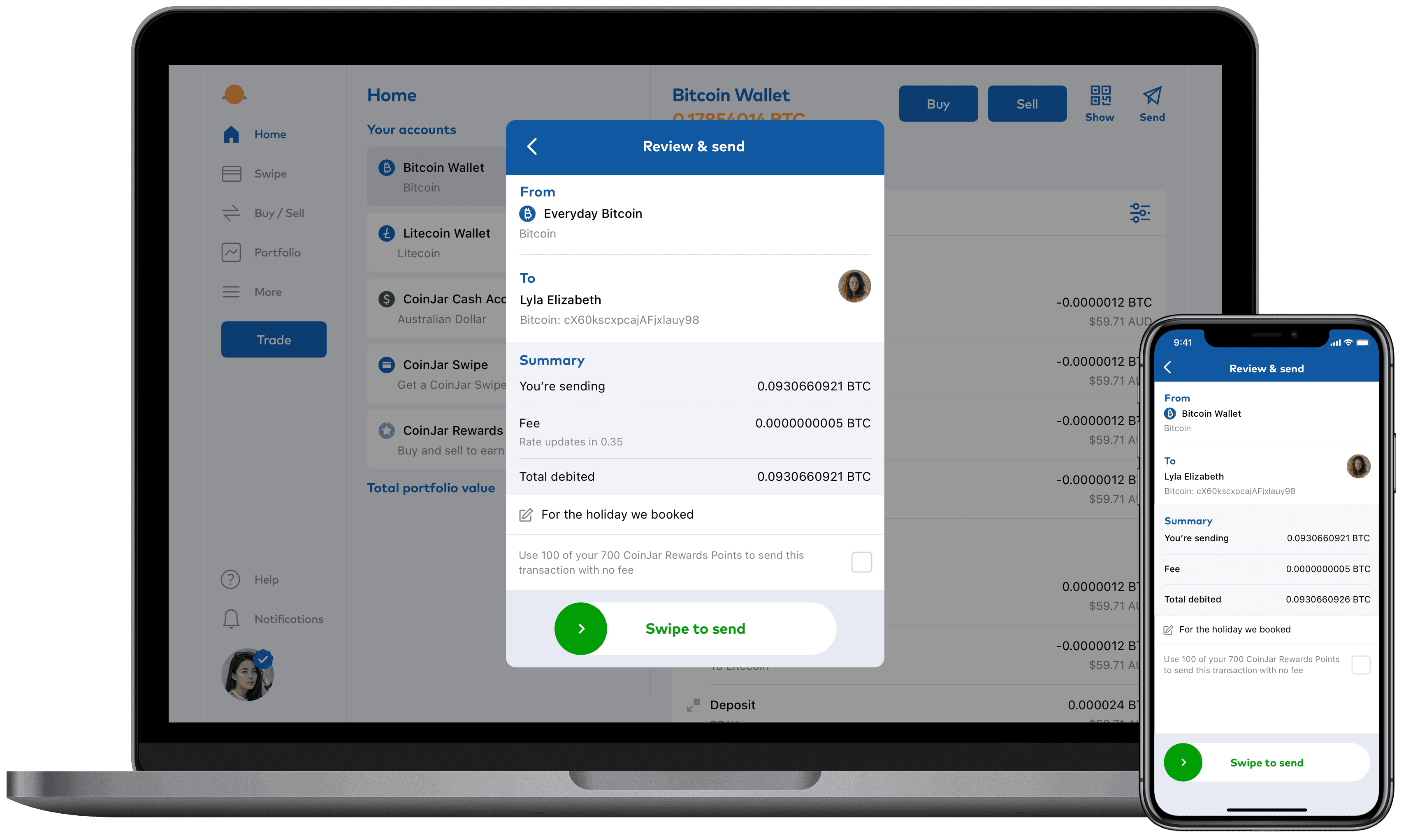
The desktop web app using the same design as mobile, but embedded in a modal.
Demystifying crypto transactions.
We avoided using crypto-jargon as much as possible — opting for clear, straightforward language, and designing transaction flows that were familiar with traditional banking. For first-timers, cryptocurrency has some quirks that can lead to irreversible errors and, in worst-case scenarios, losing assets into the crypto-void. We aimed to strike a balance between first-timers and enthusiasts; cautious but not getting in the way.
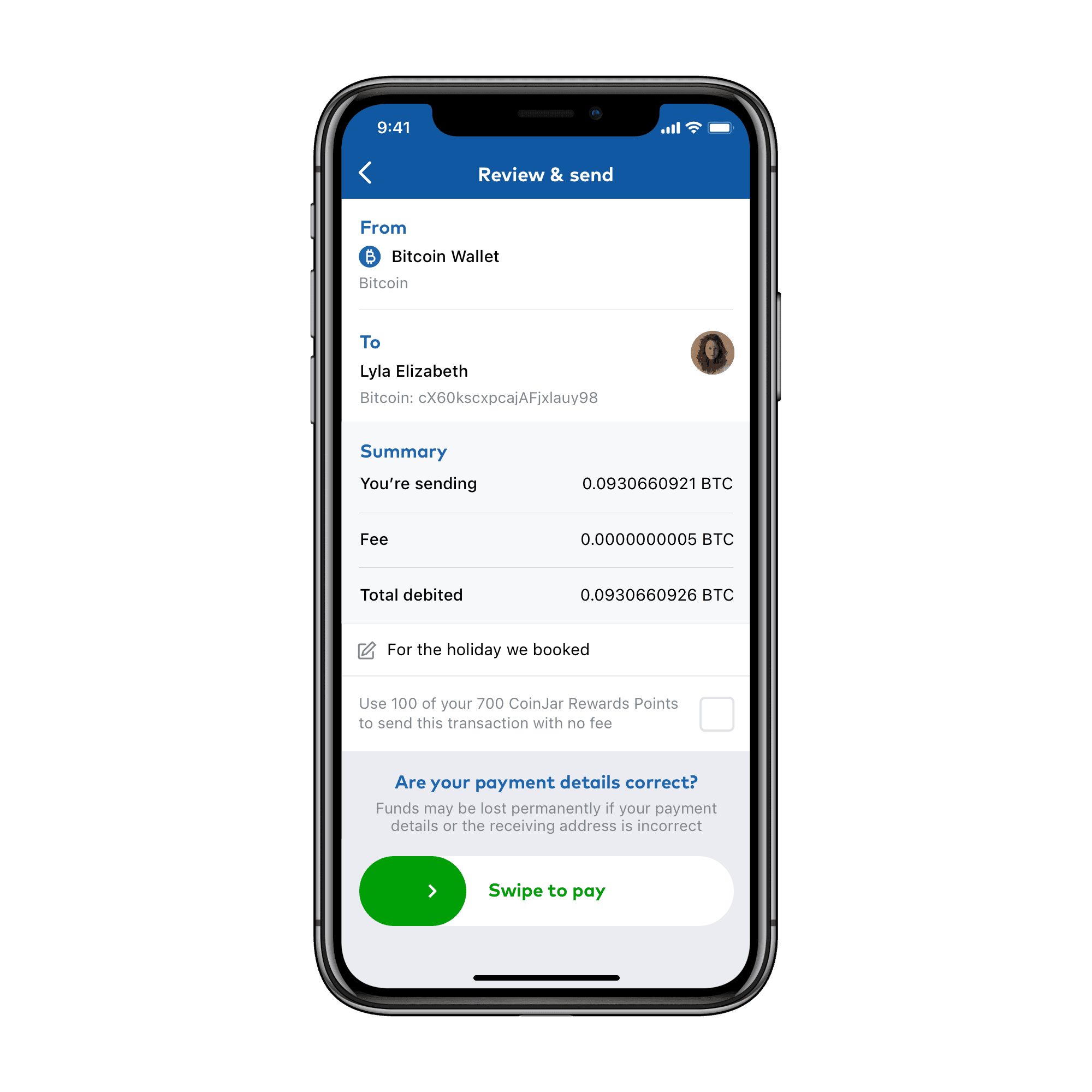
A small reminder for protecting the user from making irreversible errors — without getting in their way.
Prototype, test, iterate.
Being a small design team we opted to do usability testing through a local agency, with us overseeing the in-person sessions. Click-through prototypes were created of various user journeys and flows for testing. The agency provided us a usability report with insights that guided further iterations on the designs.
👩🏼🦱 Amelia, The Crypto Curious
Background: A recent graduate looking to invest in crypto. Values ease and educational resources. Wants guidance through the crypto world without feeling overwhelmed.
Feedback: Found the streamlined sign-up and verification refreshing and less intimidating than expected. Would appreciate a brief tutorial or walkthrough of her first transaction to build confidence.
👨🏽🦲 Kofi, The Experienced Investor
Background: Has been trading crypto for years and uses various platforms. Looks for efficient, secure transactions. Wants advanced features without the clutter, appreciates streamlined processes.
Feedback: Liked the overall functionality but felt the app lacked advanced options for experienced users, such as detailed analytics or custom alerts. Requests a "pro" interface option for quicker access to advanced trading tools without navigating away from the main interface.
👩🏻🦰 Mia, The Skeptical Newcomer
Background: Interested in crypto but hesitant due to security concerns and complexity. Wants a simple, secure platform that doesn’t bombard her with jargon.
Feedback: Was relieved to find the app used clear, straightforward language, making her more comfortable exploring more features. Suggested incorporating pop-up definitions for any unavoidable technical terms that appear, enhancing the educational aspect.
Real world testing.
Once we felt confident in our designs and were coming close to a public release, we further tested in a closed-beta, with real people, and real data. We gathered valuable insights that we further iterated on. A favourite of mine was a fairly simple problem that only real world testing would have highlighted. Pull-to-refresh for updating prices was a highly requested feature. Initially the developers had a very clever solution by automatically refreshing prices when the blockchain updated, but users felt unease not having manual control. We implemented a playful micro-interaction, that was prototyped by me in Framer, and later brought to life by our frontend developer.

A playful pull-to-refresh interaction prototyped in Framer before being handed off to a developer.
The outcomes, and learnings.
I came into this project with very little knowledge about cryptocurrency to knowing the difference between a hard fork and a soft fork, ERC-20 tokens and non-fungible tokens (NFTs), and in some ways even more confused!
As for the redesign, it was mostly welcomed with positive sentiment, with some long-time users unhappy with the major changes leading to confusion of an app they were once extremely familiar with. In retrospect, a gradual iterative approach may have resulted in a less jarring experience.
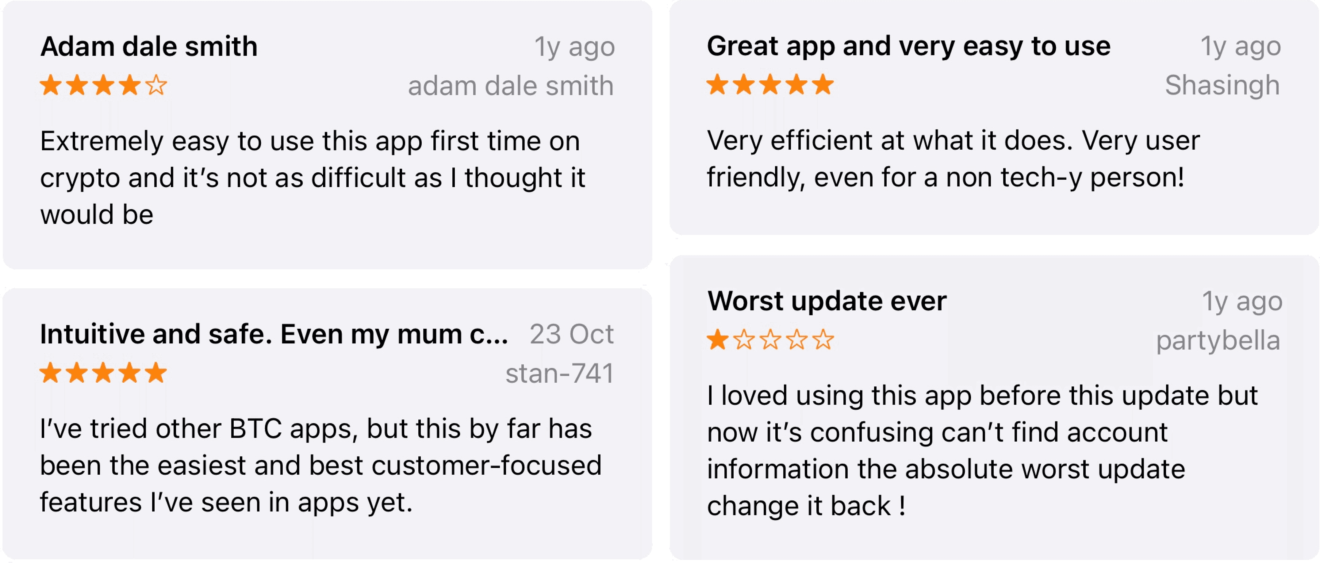
The CoinJar iPhone app rating saw a huge improvement from 1.4 to 4.7 (out of five) within the first few weeks of launch. With similar improvements across Android and web. The CoinJar iPhone now app holds a consistent place in the top 100 Finance app on the App Store — a major achievement that has significantly increased growth and ultimately the bottom line for CoinJar as a business in a highly competitive landscape.